|
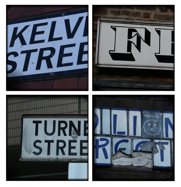
For this design I enhanced chose 4 photos and cropped them, arranging them into a grid, I then went on the enhance the images and apply a yellow/orange filter to give a vintage rusty look. I then applied the gradient to the edges and corners of my photos to give them the look of a polaroid picture. I preferred the look of the vintage filter to the others because i think that this design relates the most the Ed fellas work. 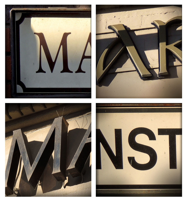
1 Comment
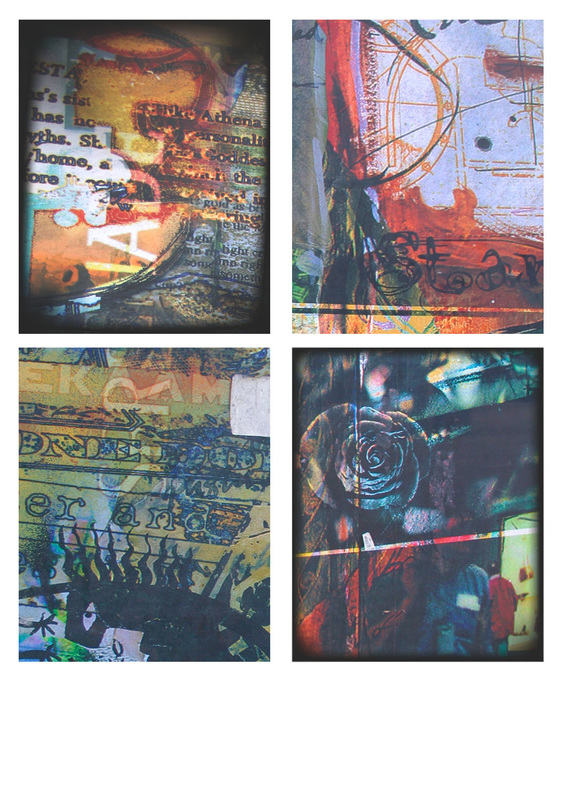
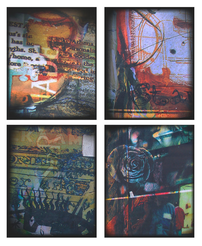
I found that this particular photograph had lots of interesting elements to it so i selected the parts of the photo i wanted and arranged them into a grid. I then went on to enhance and increase the vibrancy of my photos to make the colours in this design really stand out. I used the gradient tool to again deepen the image but this time i made the gradient a bit darker to contrast with the colours in the photograph. 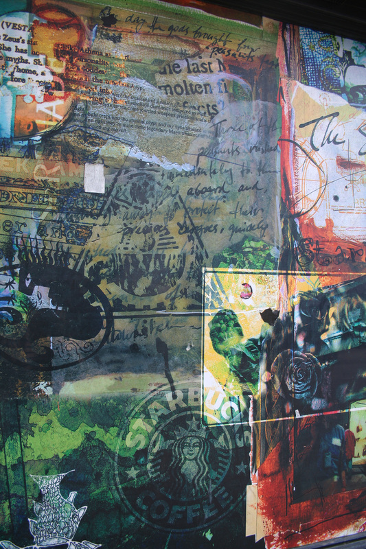
  For this design i used 4 different images instead of selecting 4 parts of the same image. I found this to make the design more interesting because each section is completely different and the pictures therefore contrast against each other. I slightly enhanced and cropped the photos and again arranged them in a grid like Ed Fellas photography. I then used the gradient tool to deepen the images and give more vintage look. I prefer using the different photos to taking parts of the same photo in my designs.
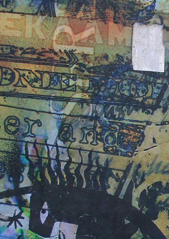
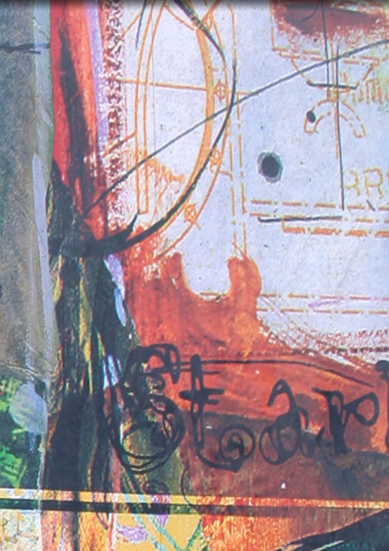
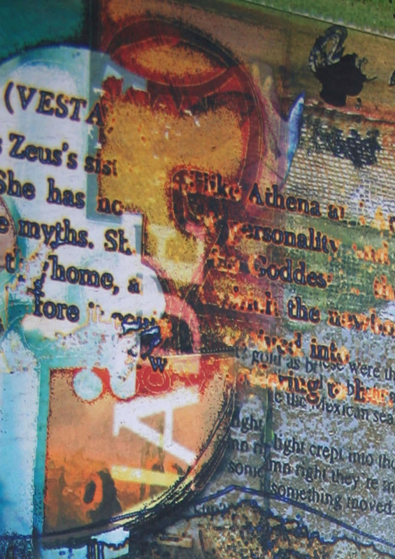
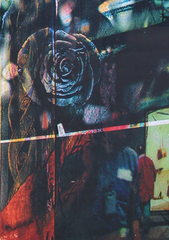
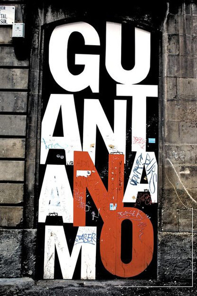
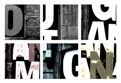
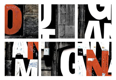
 I wanted to find other ways to deepen the photos and create a vintage polaroid look. I brightened and contrasted the photos first to enhance the photos and i then went on to increase the vibrancy of the photos slightly. I cropped the interesting parts of the photos into a grid and to further deepen and create interest in the photos i used the gradient tool. I applied a straight gradient across the edges of the photos and a curved gradient in some of the corners. I found that this did deepen the image and also gave the look of a polaroid picture. I found that the gradient also created a focal point in the photos. 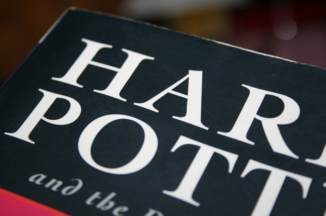 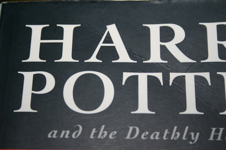 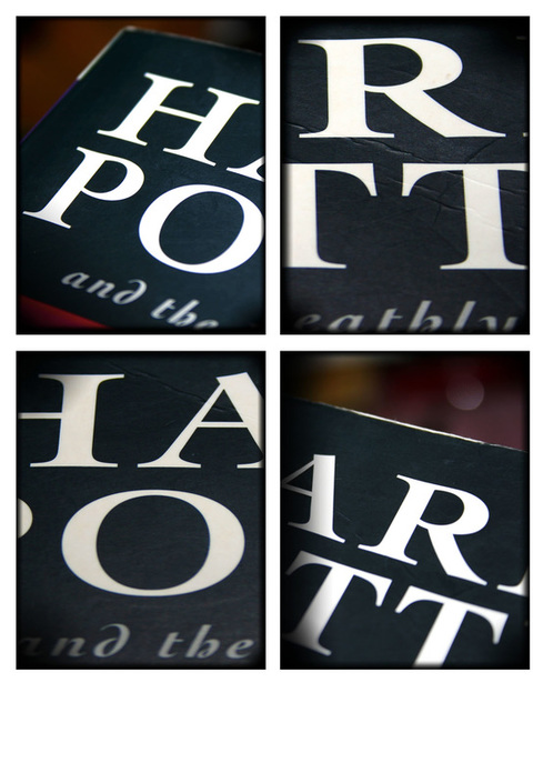 I wanted an alternative to the coloured option for my design ideas. I first again selected the most interesting areas of my picture and arranged them into a 2x2 grid, leaving a white boarder around the photos creating the polaroid picture affect. I applied a black and white filter and raised the contrast to deepen the black so the lettering stood out. I found this to look quite harsh so i decreased the brightness and the exposure levels. 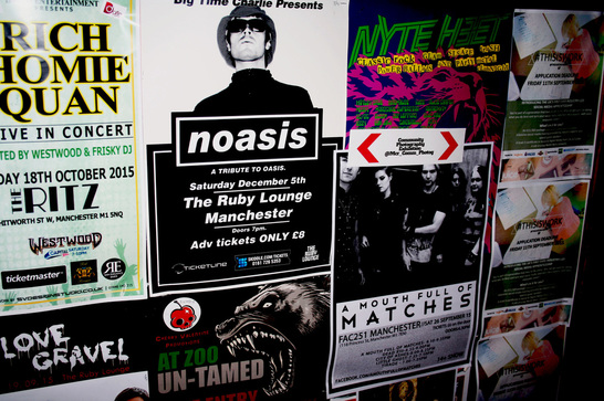  I wanted to take interesting parts of one picture i liked and college the photos like Ed Fella. I brightened and contrasted each photo to deepen and enhance the image. I then changed the colours of the photos slightly by applying a blue coloured filter to give a polaroid look to the photos.I wanted to do this because Ed Fella was known to take his pictures on a polaroid camera and i also found the vintage affect more interesting.  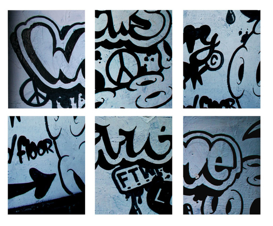 This time with Photoshop I wanted to make the colours a lot more vibrant and bold. I achieved this by slightly shifting the brightness and contrast to enhance the pictures and then I increased the vibrancy of the colours to make each section bright and interesting.   Before I experimented with my own photos I thought I'd play around and practice enhancing and cropping photographs in an Ed Fella style with an urban picture taken from the internet. I cropped six interesting places in my chosen photo and collaged them in a grid. I enhanced the photos, changing the brightness and contrast. I also made the orange colour more vibrant so that the overall picture stood out more. I wanted the overall picture to look bold and interesting just like Ed Fella's photographs which was achieved by enhancing and contrasting the colours.
|
AuthorWrite something about yourself. No need to be fancy, just an overview. ArchivesCategories |
 RSS Feed
